
The Dead Don't Die Feature engineer zombies out of your data!
Introduction
While looking for an interesting dataset to hone my data science skills, I stumbled upon one about heart failure prediction. It drew my attention as it’s more real-life and with impact than, say, predicting who will survive the Titanic disaster (I really hope no one is planning to rebuild that ship and actually put people on it again ;-).) In the stark contrast, predicting who will survive after a heart failure incident might be of future use.
The dataset is
-
analysed in this paper: Davide Chicco, Giuseppe Jurman: Machine learning can predict survival of patients with heart failure from serum creatinine and ejection fraction alone. BMC Medical Informatics and Decision Making 20, 16 (2020)
-
available from Kaggle
The motivation behind this post is that I believe the paper authors made a mistake in feature engineering thus selecting patients that might have died as “survivors”, hence the potentially dead patients don’t die in the analysis.
If you want to see the full code behind this post, have a look at the notebook.
Data Cleaning and Exploration
The original dataset looks as follows.
| age | anaemia | creatinine_phosphokinase | diabetes | ejection_fraction | high_blood_pressure | platelets | serum_creatinine | serum_sodium | sex | smoking | time | DEATH_EVENT | |
|---|---|---|---|---|---|---|---|---|---|---|---|---|---|
| 0 | 75.0 | 0 | 582 | 0 | 20 | 1 | 265000.00 | 1.9 | 130 | 1 | 0 | 4 | 1 |
| 1 | 55.0 | 0 | 7861 | 0 | 38 | 0 | 263358.03 | 1.1 | 136 | 1 | 0 | 6 | 1 |
| 2 | 65.0 | 0 | 146 | 0 | 20 | 0 | 162000.00 | 1.3 | 129 | 1 | 1 | 7 | 1 |
| 3 | 50.0 | 1 | 111 | 0 | 20 | 0 | 210000.00 | 1.9 | 137 | 1 | 0 | 7 | 1 |
| 4 | 65.0 | 1 | 160 | 1 | 20 | 0 | 327000.00 | 2.7 | 116 | 0 | 0 | 8 | 1 |
Let’s have a look at the descriptive statistics of the data.
| age | anaemia | creatinine_phosphokinase | diabetes | ejection_fraction | high_blood_pressure | platelets | serum_creatinine | serum_sodium | sex | smoking | time | DEATH_EVENT | |
|---|---|---|---|---|---|---|---|---|---|---|---|---|---|
| count | 299.000000 | 299.000000 | 299.000000 | 299.000000 | 299.000000 | 299.000000 | 299.000000 | 299.00000 | 299.000000 | 299.000000 | 299.00000 | 299.000000 | 299.00000 |
| mean | 60.833893 | 0.431438 | 581.839465 | 0.418060 | 38.083612 | 0.351171 | 263358.029264 | 1.39388 | 136.625418 | 0.648829 | 0.32107 | 130.260870 | 0.32107 |
| std | 11.894809 | 0.496107 | 970.287881 | 0.494067 | 11.834841 | 0.478136 | 97804.236869 | 1.03451 | 4.412477 | 0.478136 | 0.46767 | 77.614208 | 0.46767 |
| min | 40.000000 | 0.000000 | 23.000000 | 0.000000 | 14.000000 | 0.000000 | 25100.000000 | 0.50000 | 113.000000 | 0.000000 | 0.00000 | 4.000000 | 0.00000 |
| 25% | 51.000000 | 0.000000 | 116.500000 | 0.000000 | 30.000000 | 0.000000 | 212500.000000 | 0.90000 | 134.000000 | 0.000000 | 0.00000 | 73.000000 | 0.00000 |
| 50% | 60.000000 | 0.000000 | 250.000000 | 0.000000 | 38.000000 | 0.000000 | 262000.000000 | 1.10000 | 137.000000 | 1.000000 | 0.00000 | 115.000000 | 0.00000 |
| 75% | 70.000000 | 1.000000 | 582.000000 | 1.000000 | 45.000000 | 1.000000 | 303500.000000 | 1.40000 | 140.000000 | 1.000000 | 1.00000 | 203.000000 | 1.00000 |
| max | 95.000000 | 1.000000 | 7861.000000 | 1.000000 | 80.000000 | 1.000000 | 850000.000000 | 9.40000 | 148.000000 | 1.000000 | 1.00000 | 285.000000 | 1.00000 |
A few observations so far:
-
There is a typo with a superfluous ni in
creati(ni)ne_phosphokinase(serum_creatinineis correct). -
The column
sexshould be interpreted (as mentioned in the paper) asMalefor value 1 andFemalefor value 0. Let’s rename it toMalefor clarity. -
For convenience, let’s rescale platelets by dividing by 1000.
-
32% of patients passed away. The dataset is imbalanced, which we’ll need to keep in mind
-
The column names should have units and improved formatting. We take the former from the paper.
-
The columns are either binary or numerical. There’s no categorical columns (`sex’ having only two values here may be interpreted as binary)
Now the dataset looks more readible:
| Age [years] | Anaemia | Creatine Phosphokinase [mcg/L] | Diabetes | Ejection Fraction [%] | High Blood Pressure | Platelets [1000 platelets/mL] | Serum Creatinine [mg/dL] | Serum Sodium [mEq/L] | Male | Smoking | Time [days] | DEATH_EVENT | |
|---|---|---|---|---|---|---|---|---|---|---|---|---|---|
| 0 | 75.0 | 0 | 582 | 0 | 20 | 1 | 265.00000 | 1.9 | 130 | 1 | 0 | 4 | 1 |
| 1 | 55.0 | 0 | 7861 | 0 | 38 | 0 | 263.35803 | 1.1 | 136 | 1 | 0 | 6 | 1 |
| 2 | 65.0 | 0 | 146 | 0 | 20 | 0 | 162.00000 | 1.3 | 129 | 1 | 1 | 7 | 1 |
| 3 | 50.0 | 1 | 111 | 0 | 20 | 0 | 210.00000 | 1.9 | 137 | 1 | 0 | 7 | 1 |
| 4 | 65.0 | 1 | 160 | 1 | 20 | 0 | 327.00000 | 2.7 | 116 | 0 | 0 | 8 | 1 |
We shall make different plots for binary and non-binary variables.
Let us plot the binary features with the sex of a patient colour-coded.
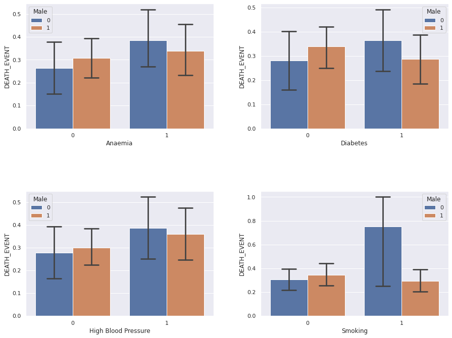
Perhaps surprisingly, the categorical features: anaemia, diabetes, hypertension and smoking, do not seem to exhibit
statistically significant impact on the patient survival prospects. Neither does the sex. Curiously, the big uncertainty
for the smoking women (sex = 0) must be reflective of very few patients in this category.
Indeed there were only 4 such women and 3 have passed away, yielding 75% value of the bar height and big uncertainty.
Now, we’ll peek at the non-binary features. We’re going to use histograms with either patient category superimposed as well as box plots, where the horizontal bars mark the ranges and quartiles.
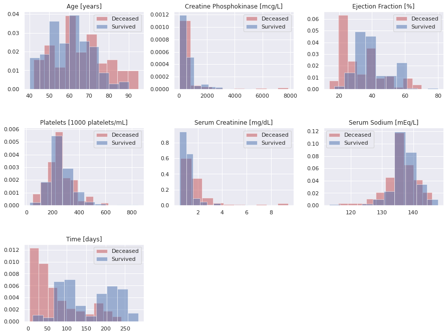
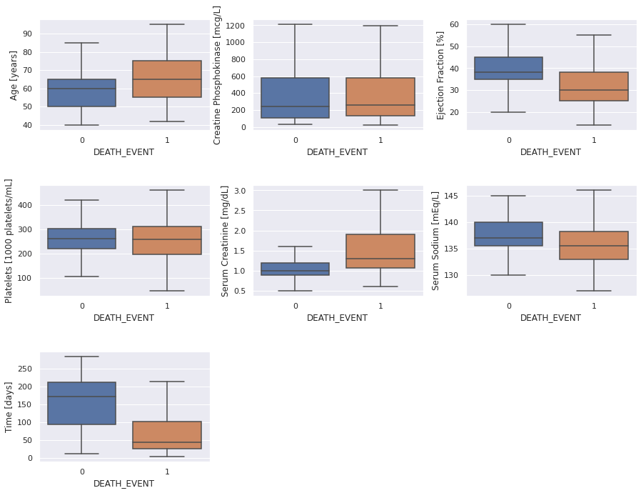
Here are some observations from the above graphs.
- Age: patients above the age of 70 are obviously at a higher risk
- Ejection Fraction is a strong predictor, especially below around 30 units
- Serum Creatinine is also a very strong feature, specifically about around 2 units
- Serum Sodium might be a helpful feature, but a little less so than the two previous ones
- Follow-up Duration (Time): We can tell that the patient chance to die in the follow-up period roughly follows an exponential distribution, for those that will not survive, as one might expect. The meaning of the follow-up period for the survivors is different: it seems it merely reflects how long these patients were monitored.
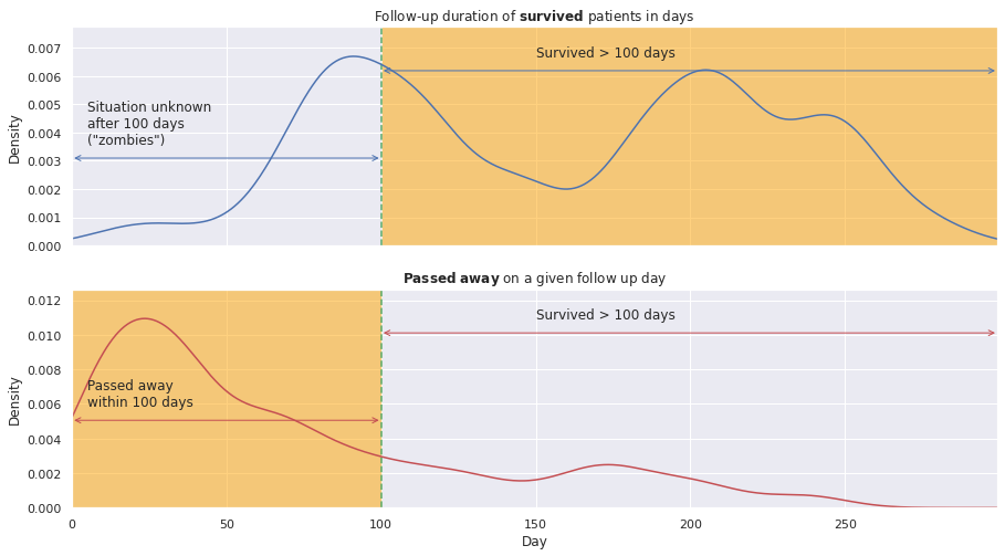
Let’s have a closer look at the follow-up duration. Below we plot it for the deceased patients on top and for the “surviving” ones on the bottom.
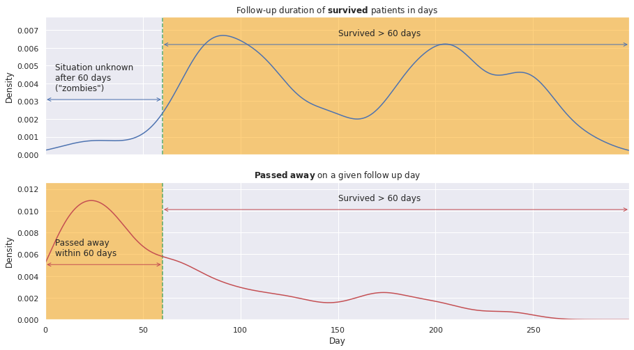
Indeed, the ‘Time’ feature has different meaning for either category of patients:
- for survived patients: duration of the follow-up time
- for deceased patients: day of their passing
Therefore, the former ones might have passed away anytime after the follow-up termination. For instance, they might have passed away anytime between their follow-up duration and the full 350-day period. Hence, the patients that are potentially dead, don’t die in the data; they will be hereafter referred to as ‘zombies’ ;-).
As a break while reading this post I recommend the wonderful Sturgill Simpson’s “The Dead Don’t Die” song ;-)
Selecting the ‘survivors’ of follow-up duration greater than \(m\) days (\(Time > m\) days) means they have certainly survived the first \(m\) days. On the other hand, to be consistent, we must choose the ‘non-survivors’ who have passed away within the first \(m\) days (\(Time < m\) days). The corresponding regions are highlighted in the graphs.
This way we will be able to analyse how likely a given patient is to survive \(m\) days, e.g. 2 months, after the heart failure.
The patients whose follow-up duration is smaller than \(m\) need to be rejected, reducing our statistics.
Curiously, for the survivors (within \(m\) days) target label, we might also include the ones who passed away after \(m\) days. However, it seems preferable not to do this: I would rather tell a patient they are going to survive at least \(m\) days if they might survive even longer than that rather than if they are bound to pass away anywhere from the day \(m+1\) onwards. Both approaches are fine, though, as long as we remain clear.
At this point it is astonishing that the paper authors ignored the \(Time\) variable in one of their studies, trying to justify it as follows:
In the previous part of the analysis, we excluded follow-up time from the dataset because we preferred to focus on the clinical features and to try to discover something meaningful about them.
This approach is evidently biased as they might have had contaminated train and test samples: people who might have died were considered survivors.
Let us see how many patients are we left with for various values of \(m\).
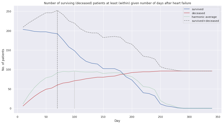
Maximising harmonic average ensures the two variables are high and close by (i.e. balanced). The harmonic average approximately has a plateau in the region around 75-175 days. We might try to run the ML algorithms in that range.
The maximum harmonic average in on the 100-th day and the maximum sum of survived and deceased patients is achieved if we split at the 70-th day. If we want to have both, high statistics and good balance between the categories, we should consider splitting around the 75-100 days, yielding around 210-250 patients. Of course, all other values are technically possible, but they should yield less precise ML performance (which claim we might test).
We’ll select, therefore, the highlighted below regions of either patient group.
Conclusions – what I’ve learnt so far
- Feeding features directly to an ML algorithm is a wrong practise
- Meaning of target labels might be more subtle than it seems (here ‘DEATH_EVENT’ relates to another feature, follow-up time);
- Here, we must extract the target labels using another feature before making predictions
- Ignoring some features we do not understand is dangerous, especially if they somehow relate to the labels
- Be patient and use a “pause and think” (or “pause and plot”) approach before any classification / regression
- Regarding data collection, the follow-up period should have been the same for each patient (if possible), e.g. 1 year. It is understandable, though, that it might have not been possible.
In the next post we’ll implement a couple of classifiers to predict patient survival within 100 days after a heart failure.